


These were all fonts picked from dafont.com, however in the end I decided on this font:
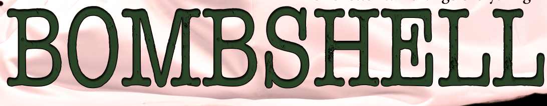
and I decided that it looked better and suited the army/camo style if it were in a dark green colour.
For the credit box on the bottom of my poster, I used this font:

It has the titles of the crew already formatted to each letter, which helped me to include all of the necessary roles that would be in a professional film.
Below is an example of every other font I have used either on my poster or on my double page spread article:

I used this because it is simple and easy to read, and will look better on my work, rather than having lots of different artistic fonts.

I used this font for the title of my magazine and for the update title box on my article page. It is bold and eye catching and easy to read, so that is what I chose it.

I used this font for the title "Reviews" because I wanted it to contrast with the rest of the text, especially the titles. I wanted it to look almost hand written, to make it interesting and creative.
Every other font are simple and easy to read because I didn't want a font to take away from what the text was saying, like the actual article itself on my double page spread.
No comments:
Post a Comment